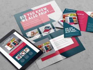
Everybody thinks they know what a good brochure should look like, but actually creating one that customers want to read requires getting a number of different design decisions right.
Almost every business uses brochures in their marketing. They recognise the role they play in giving customers something to touch, keep and pass on to others. The downside to that is that it has become harder to make your brochure stand out amongst the competition. Once a customer has been handed one of your brochures, within a few seconds they know whether they’re going to spend time reading it or simply discard it. First impressions are everything, then, but they need to be backed up once the reader turns the page.
Here are some ways you can keep your customers turning so you can start selling:
1. Give them something unexpected
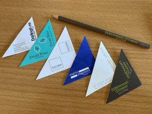
Instead of producing a standard A4 or A5 brochure, think outside the box a bit and give your customers something they won’t be expecting. Folding paper is a cost-effective and engaging way to connect with your customers. You can pack a surprising amount of information into a relatively small space with a folded design. Compress the brochure so that it’s pocket sized, allowing your customers to easily tuck it away and come back to it at a more convenient time.
2. Make it high quality
Whatever design route you decide to take with your brochure, make sure that you don’t compromise on quality. Traditional paper won’t wash with readers and it shouts ‘disposable’ – consider a silk-coated paper instead that produces a more luxurious finish with better image reproduction. Silk paper is also more resistant to dirt, moisture and wear, giving your brochure a longer ‘shelf’ life and increasing the chance of customers of passing it on to others.
3. Keep it simple
You can’t be sure how well-versed in your company the reader is going to be when they get their hands on your brochure. Keeping the design fairly simple and easy to understand will allow them to understand what your business does no matter where they are in the customer journey. Placing well sourced imagery around simple statements will make your visuals ‘pop’ on the page and draw in eyes to where you want them.
4. Get the imagery right
There’s no point in deploying simple, clever design and using high-quality silk-coated paper if your visuals are poor. Whether you have products or a service to sell, speak first with the printing firm to see what type of images they need, in which format, to be able to bring your brochure to life in the most impactful way.
5. Tell a story
Not everyone who picks up your brochure is going to make it to the last page, but that should be the ultimate aim. Give readers a reason to keep turning by telling a story with your brochure. That’s not to say that you should drop the sell – but make sure you do it in an engaging and compelling way.
If you need expert design or print advice for producing a brochure that stands out among the rest, contact us.


